| Monday, November 12, 2007 |
14:47 - That don't seem right
|
(top) |
I just noticed this. What's up with the drop-shadows below the items in an expanded Stack?
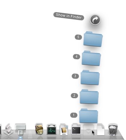
At first it looked like only the round "Show in Finder" icon at the very top of the stack got a shadow; but now, by isolating the widgets against a white backdrop, it looks like every item in the list is being given a drop-shadow of the same shape and size as that topmost entry.
Either way, it's dumb. Has the feel of a hack to me, like they couldn't determine the shape of each item's icon on the fly or something; but that hardly seems likely, as they've been able to do that since 10.0. And that's like seven years ago now. (Besides, couldn't they just approximate the shape of each item? These drop-shadows are so soft it's not like anyone would even notice if it was folder-shaped or document-shaped or blob-shaped; just as long as it wasn't this dinky little circle.)
|
|
 Brian Tiemann