| Wednesday, May 16, 2007 |
17:32 - Fat Guy Stuck in Television
http://www.adultswim.com/video/index.html
|
(top) |
Sunday night was a Cavalcade of Pilots on Adult Swim. I didn't see them all, but the ones I did see at least had a few things going for them—not least of which was that they were actually animated, bucking the trend wherein shows with less and less well-disguised live-action material are still billed as being worthy of showing on "Cartoon" Network.
Superjail, while violent and crude, I found oddly enthralling. Why? Primarily because of the Wonka-esque Warden, whose character design and movement is straight out of those white-background psychedelia/educational animated squibs from the 70s. Only this time it has the added sass that comes from the post-Space Ghost irony in which all animation is steeped these days. For some reason, rather than looking like me-too-ism after all the Harvey Birdmans and Sealab 2020s that have come and gone, it gives this show a certain exhilarating energy, like someone's Biology textbook cover come to life—someone who secretly nursed a dream of being an animator even though the art classes at his school had been cut in favor of football. The anatomical polish and draftsmanship on characters like the Warden are marginal at best, to be sure... but as John K. would no doubt agree, an ability to draw like a CalArts grad doesn't help if you can't make a character move in an appealing manner. And if you can, an ability to draw like a CalArts grad doesn't matter. In other words, he's a cartoon, not just an animated character—and he inhabits a world where he can toss his cane onto a hat rack and it goes limp as it droops over a peg, and he ties himself in knots to illustrate his past mental contortions. We haven't seen something so freely whimsical and traditionally cartoony in years.
Following Superjail was the pilot for the Drinky Crow Show, the TV-ification of Maakies. Now this one is what most people seem to appreciate most (judging by the ratings), but it's also the one that's the least true to its nature—and perversely enough, it's that way mainly through trying way too hard to be true to its nature. It's a CG-animated stream of consciousness whose writing and voice acting is a fine adaptation of the comic strip's pace and atmosphere, but the CG execution—which was clearly decided upon as a compromise to allow Tony Millionaire's gorgeously realized world of tall ships and Victorian architecture to make the jump to the animated screen—unfortunately ends up drawing too much attention to itself, and you're never unaware that what you're watching is, in fact, CG. Characters move just a bit too smoothly. 3D body structures are just a bit too symmetrical. The ink drawings that make Maakies what it is are near-perfect in their execution, but it's their slight imperfections that make them so real—and seeing all the rough edges smoothed out in the CG transition makes the sailing ships and sea monsters and hangin' trees turn from feats of wonder by a master of the pen into empty, Family Guy-esque backdrops and set pieces straight out of some digital prop catalog. Compare:
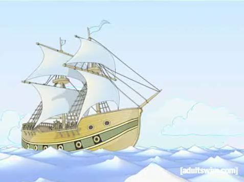 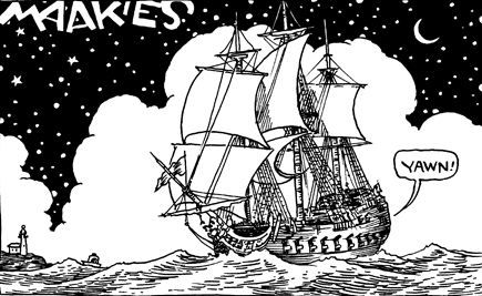
Call me crazy, but the latter steals my heart, whereas the former embezzles from my eyeballs.
Granted, it would have been literally impossible to actually animate Millionaire's drawings, in the traditional, pencil-and-paint sense; but this next-best-seeming solution, I'm afraid, is far from the next-best solution when it comes to the end product. Sure, it's funny; but the charm of Maakies is the art itself, and I'm not sure what the show will be without that. Some characters—like Popeye and Mickey Mouse—just don't make sense in 3D.
I didn't see the rest of the pilots. Were they any good?
|
|
 Brian Tiemann