| Thursday, April 10, 2003 |
02:22 - More dollars than sense
|
(top)  |
Okay, so here's something that's been bugging me about Fox's coverage since the start of the war.
No, it's not about the political angle, or the commentators, or anything like that. It's about the video screen they use as a digital chalkboard for describing troop movements and such.
It's one of those big widescreen flat-panel plasma displays-- the ones that were like $15,000 a year or two ago, but now are "only" about $7,000; now you can see them in every booth at any given trade show, lining the walls of airports, and even showing ads above the concession stands at movie theaters. Yeah, they're expensive as hell-- but they're cool.
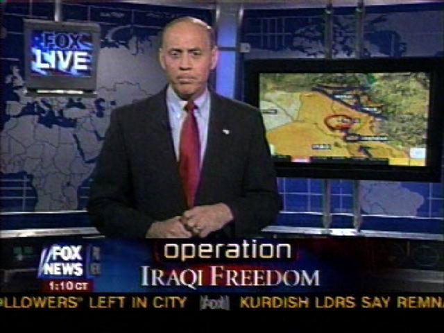
The trouble is, Fox appears to be using one purely for the sake of this camera shot shown here, with the screen off to the side so the commentator can gesticulate at it. It looks nice and slick.
However, the image displayed on it is stretched. It's a widescreen display; but they have to put a map on it, and then switch it to the full-screen feed so it fills the TV audience's 4x3 screen. When it's on the plasma display, it gets stretched to fill the display shape.
Which is usually fine for abstract stuff, but for maps it sucks butt. It means half the time, the displayed map or satellite image or flyover is distorted horizontally, and the rest of the time that big gore point in the Tigris looks more like a gentle bend in the river and less like a pancreas. When you're dealing with maps in particular, this makes distances misleading and undermines the point of trying to display a map.
I guess there isn't a good solution to this, other than not using the widescreen display for the gee-whiz camera angle in the first place, but then they'd look all low-tech and stuff! We can't have that, now...
... Okay, rant over.
|
|