| Friday, April 4, 2003 |
13:49 - My God, we've got to try something!
|
(top)  |
There's a Deep Thought by Jack Handey that goes like this:
I think a new, different kind of bowling should be "carpet bowling." It's just like regular bowling, only the lanes are carpet instead of wood. I don't know why we should do this, but my God, we've got to try something!
Sometimes I feel as though the designers of everyday products have a sentiment just like this gnawing at their brains. It's the assumption-- nay, the conviction-- that what we have in our cars, our computers, our mixers and blenders just can't be the best possible solution for the problems they address. It's the belief that even though we came up with certain solutions years or even decades or centuries ago, there's no way we could have "gotten it right" way back then.
We were replacing the doorknobs in the doors of the new house last weekend, and I started thinking about the design of doors. How long has the basic shape of the "door" been part of our collective psyche? The knob at waist level, right at the edge opposite the hinge? It seems an obvious design. It makes perfect sense. If the knob is as far as possible from the hinge, you get the optimum leverage when pushing or pulling it open; and if the knob and the latching mechanism is right at the edge, it can interface easily with the strike plate with very little supplementary hardware. Doors in corporate buildings with crash bars and automatic openers and such can get very complex in execution, because they don't follow this model. Push on a crash bar near the hinge, and it's much harder to open than if you push on it near the opening edge. And how do you lock double doors with crash bars? It's got to have a weird vertical bar mechanism to latch it into the ground or the ceiling. But that's the best solution for the problem at hand.
So I look at memes such as Tolkien's hobbit-holes. And it turns out that Tolkien fell prey to the desire to do something "different for the sake of being different", by designing round doors with the knob right in the middle. Sure, it's aesthetically nice. But as far as practicality goes, it's off the map. The set designers of Peter Jackson's LotR movies found that creating a functional hinge for a round door was ass-hard. I mean, think about it. How is a hinge like that supposed to work? It's one of the least practical mechanical interactions I can think of. Sure, the set designers did a marvelous job, and a plausible one for that matter, and that's superhuman of them. But the overall point is that no primitive people would have come up with round doors with center-mounted knobs. It just wouldn't happen.
But fantasy and sci-fi authors find themselves in that quandary all the time. Every space movie and TV show has funky-shaped sliding doors. Some sliding doors rotate up and out of the way; others latch together like those horrible hooking mechanisms on old model train sets. Some have three-inch-high door sills for people to trip on. And it's all for the sake of looking "alien" or "futuristic", as though our current metaphor for "door" is bound to become outmoded any day now. Sci-fi authors and game designers create spaceships that are cube-shaped (Star Trek) or completely asymmetrical (the Wing Commander series, EVE Online), often using the snooty rationale that symmetry and swoopiness are human conceits, metaphors that never would have caught on in another spacefaring culture. The reality is, however, that they turn out to be practical. Swoopy shapes will always derive from atmospheric flyer designs, which have to look a certain way because of the laws of physics, which don't change no matter what lens you look at them through. And symmetry is practical for all kinds of reasons. If you put your thrusters off-center, the ship will spin. Even in deep space there's such a thing as inertia.
It's an open question whether sentient beings on other worlds would evolve to look just like humans, for these same reasons. There are arguments to be made either way; we look the way we do because of environmental pressures on our own developmental history. Slightly different pressures elsewhere would produce different-looking creatures. But chances are that they wouldn't have an odd number of legs, for example. It just wouldn't be physically practical. So I can more or less accept sci-fi concepts with aliens who look suspiciously humanoid, and I'm leery of such concepts in which the aliens have been given every possible tweak in order to make them as "alien" as possible.
But I have no problem, for instance, accepting a sci-fi future in which people wear baseball caps. Hat designs have come and gone over the centuries; from the simple hoods of medieval times, to the big wide-brimmed floppy things that got pinned up to make two or three corners in the 18th century, to yarmulkes and fezzes, hats have always had a considerable amount of style and fashion go into their design-- often overshadowing any practicality considerations (aside from specialized designs like sombreros and cowboy hats). But the baseball cap is quite possibly the most efficient and practical hat design we've ever come up with. It's spare, functional, elegant, versatile, and as unassuming or as flashy as you want it to be. I find myself having a hard time imagining that we'll ever come up with anything significantly better than the baseball cap, or that it won't outlive stylized fashion statements like the fedoras or stovepipes of our earlier history.
So many of these areas of design are simply waiting for someone to come up with "the right answer"; but all too often nobody is willing to acknowledge it when someone does.
We see this all the time in software engineering. People have been trying to come up with the inevitable successor to the "Desktop" metaphor for years now. We've had "Microsoft Bob"; we've had the "diary" or 'journal" metaphor (in which items are arranged by date of use rather than by spatial positioning). Designers have been enslaved by the notion that just because it was twenty years ago that Apple and Xerox PARC developed the Desktop metaphor for personal computing, then that metaphor has to be outmoded. There's got to be something better! After all, technology marches with the speed of the 3ID up the Euphrates. Why doesn't interface design do the same thing?
The trouble is, these new solutions that the designers keep coming up with are usually flawed. The "journal" metaphor fails because the human mind actually turns out to work with objects in spatial terms, not in terms of how recently you last used some item. Where's "picture1.jpg"? It's over here, on the right, underneath these three folders on my Desktop. You don't think "It's five items down the stack from the most recent item I used" or "It's under June 12, when I know I last used it". You think in spatial terms, supported by other kinds of meta-data. It turns out that Apple did, in fact, "get it right". And that's why, when given the opportunity (with Mac OS X) to throw aside all kinds of old metaphors that had been developed for the earliest days of the GUI, Apple actually ended up keeping a fairly large number of the elements of the old OS, and not just because they were familiar to old-school users. They kept them because they worked, and the result is something that still resembles the old Mac OS more than it does Windows (post-95 or 3.x).
This, in fact, demonstrates that the Windows designers had fallen prey to exactly the same treacherous mindset of second-guessing existing solutions. Back in the pre-95 days, they were desperately trying to come up with something that offered the functionality of the Mac, without looking too much like the Mac. The result was a garbled, confusing mess with "Program Groups" and no obvious way for the user to "get into" the interface. Windows 95 introduced several key interface elements which quite honestly revolutionized the GUI for the PC, but which still succumbed to the can't-make-it-too-much-like-the-Mac trap. (Hence things like "Recycle Bin" instead of "Trash", and icons arranged down the left rather than the right, and a bottom-centric UI rather than the top-centric UI of the Mac, and window-based contexts rather than the Mac's modal contexts.) I'm sure a lot of Microsoft's designers would have loved to adopt more of the Mac's metaphors more directly, because they knew those metaphors were right-- but were prevented from doing so because of political (and legal) pressure and the desire to make Windows "different for the sake of being different".
I'm quite sure that eventually, some kind of new metaphor will come along that will take the computing world by storm and sweep all previous interface ideas, including the Desktop, into the gutter of history. But I think it's going to have to be something really radically different-- enough so to require technology that's simply not within our grasp yet, such as completely immersive 3-D environments-- and yet something that doesn't abandon the nature of our brains, which is to gravitate toward metaphors that are spatial and visual in nature. It's going to be a while before something like that comes along; and until then, the consensus remains among UI designers to this day that Apple Got It Right.
Engineers have a very strong sense of "right and wrong"-- a kind of design ethics, if you will. There's a very deep undercurrent of firm moralistic sentiment among engineers when it comes to design; one of the most common things you'll hear engineers say in design meetings, or when discussing software's inner workings with each other, is that it should do the right thing. What does this mean? It's a belief that given a certain set of circumstances that the user finds himself in, and given a certain kind of user input or assumption, there is a clear "right thing" for the software to do. When engineers theorize about the security of SSH keys, whether and how passphrases should be stored in cleartext on the local machine, or whether and how a user should have to authenticate before committing an action or whether the software should ensure authentication in some other way, or whether a database operation or a function call needs to be done in a lock or not, or whether a certain function should be handled in a modal dialog or by a global control-- these are considerations for which there is room for debate, but engineers find it surprisingly easy to come to a consensus on what the right thing to do is in cases like this. When someone brings up the case of a user finding his way into an ambiguous circumstance or entering invalid or ambiguous input, when an engineer says "it should do the right thing", he'll get a lot of understanding nods around the table. For instance: a microwave accepts time settings in minutes and seconds; if you enter "120" it interprets it as 1 minute and twenty seconds. But the valid display range for seconds is 1-60; what do you do if the user enters "90"? Does it give an error saying you have to enter a value either under 60 or above 100? No, it does the right thing-- that is, the most correct interpretation that the user expects (e.g. 90 seconds).
UI theory is no nebulous and artistic pursuit; it's a genuine discipline with real concrete goals, goals that aren't always met for one reason or another, but goals that pretty much everyone agrees are good to have. Engineers tend not to think in the analog methods of artists and philosophers; their thoughts tend to be digital, even binary. That's why, I believe, so many Islamic terrorists have turned out to be from engineering backgrounds. The humanistic consequences of their actions seem to be things they can "turn off" in favor of their clinical pursuit of their goals. People who can see and legitimize multiple sides of an issue tend not to be so willing to commit themselves to a goal in which only one outcome or message is possible, in which success is measured by what is "right" (in one's own value system) rather than by what is "good" for humanity.
Engineers, then, aren't usually themselves the proponents of new ideas that break the norms of design purely for the sake of breaking norms. Engineers like rules and precedent; they like guidelines, ideals, specs developed in advance. Development is much easier that way, much more efficient. Engineers are seldom concerned with revolution, but rather with evolution: refining existing solutions to more closely match a predetermined ideal. If someone comes up with a breakthrough idea, great-- the engineers will leap to bring it to fulfillment of its potential. But the actual inventing and exploration is usually left to the dreamers, the Dean Kamens of the world. Because let's face it: the vast majority of inventions and breakthroughs in the world really aren't that practical. The road through engineering history is littered with Segways: brilliant; revolutionary; a solution desperately looking for a problem.
The road through world history is similarly littered with ideological Segways. Communism and Naziism were both reactions to America, that "grand experiment" that the European thinkers were determined not to be proven wrong by. How could this upstart nation of peasants and immigrants be exploding with success? Nobody, neither Hitler nor the Bolsheviks, wanted to believe that the Founding Fathers of the United States of America had actually gotten it right-- out of the blue, scribbling on parchment over mugs of ale in dimly lit colonial courtrooms. No way could they have stumbled upon the answer to the world's problems, the national model which would lead to both domestic tranquility and global prosperity. Who knew? So Hitler and Lenin tried their damnedest to prove America wrong; they espoused models of their own which were different from America's, just for the sake of being different. Communism is one of those things that looks great on paper, but there's a reason why no nations have naturally developed as communes from the start. It's a theory, and one that would make a lot of sense, if only humans were robots. Instead we find that the dirty, imperfect, exploitative machine of capitalism and entrepreneurship somehow manages-- because it's a system developed on the natural interactions of human beings-- to thrive and prosper and create miracles of commerce and technology. And Naziism, while founded on principles like "survival of the fittest" and "Chosen People"-- concepts greatly in vogue in the nineteenth century-- was fatally flawed because of the bogus assumptions that genetic purity and nationalistic identification were what made a people "the fittest", rather than miscegenation and "hybrid vigor" (and dumb luck). These ideas wouldn't have taken hold without outspoken exponents to stand on podiums and bang their fists and tell eveybody of how great their new revolutionary ideas were. In the end, they were proven the frauds that they were through the pressure of time and popular support. Just because their ideas were different does not make them right.
And so I finally come to the point that I've been meaning to make all this time: cars. You know, the automobile of today is remarkably similar to the Model-T Ford. It has four wheels; it has an internal combustion engine; it has the driver controls on one side of the cabin, in the front seat. Sure, the style has changed, as have the interior appointments and the efficiency of the engine and the general fit-and-finish, longevity, and reliability of everything. But if you were to describe a car over the phone to a Martian, he wouldn't be able to tell without a lot of tedious explanation how a PT Cruiser differs from a Stutz Bearcat or a Cord.
Some people have tried futzing with the basic configuration of the car as we know it-- putting the engine in the rear (Tucker), or by putting little motors in the individual wheels, or by using alternative powerplants, or by going to three wheels instead of four. But you know... engines are in the front of most passenger cars for a good engineering reason, and it's not just because of tradition or style. It's because the seasoned engineers of the auto industry know that it's the right thing to do given the current circumstances and technology. And cars have four wheels for very good reasons as well. We don't see three-wheeled Fords and Chevys rolling down the freeways because of perfectly valid technological rationales, not just because the engineers are too blinded by rote methods to Dare To Try Something Different. It's because someone, way back when, got it right.
And so... can anybody please explain to me what the rationale is behind center-mounted instrument consoles?
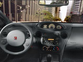
This is the Saturn Ion-- and it's not alone. It seems every concept car (and many production cars) that come out these days, whether a funky electro-hybrid (GM Impact) or a six-figure-price sportscar (BMW Z8), have their speedometer and tach and other primary gauges mounted on the center console rather than right in front of the driver. Why is this? Yes, it's an interesting aesthetic point to make... but is it not obvious to carmakers that the reason why you put the binnacle with the speedometer and tach and such things directly in front of the driver is so that he doesn't have to turn his head away from the road to see how fast he's going?
This is crucial information to the driver. Placing it as close to the driver's line of sight is a very real safety issue. In fact, I remember back in the 80s when GM was experimenting with heads-up displays to project the speed readout directly onto a semi-transparent segment of the windshield glass, so the driver wouldn't even have to look down in order to see how fast he's going. (I saw ads for similar systems as recently as five years ago. What's happened to them?) Cell phones and iDrive and onboard e-mail systems are making driver attention to the road a bigger concern than ever before. So why this sudden fascination with moving the gauges over to where they're harder to see than ever?
Unless I'm drastically missing something, this is a cut-and-dried example of different-for-the-sake-of-being-different, just as bad as (or worse than) the 1980s' fascination with digital readouts every which where-- from which the carmakers were forced to back off when it became clear that analog dials were much better indicators of frequently-changing bits of data like speed and RPMs-- data whose rate of change is just as crucial to the driver as is its instantaneous value-- than digital meters, especially ones whose values were only updated like once or twice a second. Bad, bad idea.
I'm sure some people will buy a lot of these cars because of the novelty of having stylistic symmetry across the dashboard; but I'm willing to bet that after the first week or two the novelty will wear off pretty damned fast, and going back to a standard "lopsided" car will feel like a blessed respite from the stupidity of technology that's too clever for its own good.
UPDATE: I should note that I'm not saying we should stop trying new things. That would be dumb as all hell. After all, trying wild-ass ideas just to see how well they go over is how those evolutionary changes get made, and how some revolutions get started. OS X, in its early days, tried all kinds of concepts that turned out to be stupid (the analog clock in the Dock, for example, and the non-functional Apple logo in the middle of the title bar, and renaming the Finder to "Desktop"); once it became clear that they were bad ideas, Apple came up with better solutions, many of which (such as the System Menus in the upper right) mimicked ideas that Windows had introduced.
But some wild-ass ideas have much greater consequences than others; deciding whether the AirPort status icon should be a Dockling or a System Menu item is going to have a lot less impact on people's lives than deciding whether Jews should be allowed to live. And putting the instrument cluster of a car in the center console just smacks of a short-lived fad to me.
CapLion, however, reminds me that many very successful cars have had center-mounted instruments; the Shelby Cobra, for instance, and a lot of European racer-derived cars, and the McLaren F1 (though that one has a center-mounted seat, so the point is rather moot). So it could be the retro impulse as much as the urge to Think Different.
UPDATE: James, a Saturn driver who had the same misgivings about the Ion's center-mounted instruments, wrote them an e-mail asking what the hell they were thinking. Saturn wrote back, as follows:
Thank you for taking the time to send us an email. We appreciate the time
you have taken to share your candid comments. Our brand new ION that was
released with the 2002 model year, has the instrument panel in the center of
the dashboard. It actually is placed at an angle and is at the level of the
horizon so that it is always within the driver's line of vision. This
allows us to use a smaller steering wheel with more up and down positions
for driver comfort. In addition, from the safety view point the driver does
not have to remove his/her eyes from the road to look at the instrument
panel because it is always visible, yet it does not block the view of the
road.
Ahh. So there is a rationale-- and a reasonable one at that. That's very good news; it pretty well assuages my concerns. And it raises my level of respect for Saturn by several notches.
|
|
