| Sunday, November 24, 2002 |
16:47 - Views
|
(top)  |
One of the comments in the MacSlash article linked to in the last post got me thinking. It noted that one thing on the Mac that Windows has not yet got around to adopting is the hierarchical list view.
On Windows, you've got a whole series of views available-- from "icon" (and now "thumbnail", which does previews of previewable file types, not actual custom icons or anything) up through "list" and "details". But something that I'd never really noticed, or at least it never leaped out at me until I started thinking about it, was that the three different views on the Mac-- icon, list, and column-- are fundamentally different styles of viewing files, each with their unique metaphors and capabilities... whereas the views on Windows are a continuum, each setting gradually making the icons smaller and adding more information. Icon view lets you move the files around to arbitrary positions, while list view sorts them by some criterion; but that's about the only major difference. It's still just a list of files. The folders in Windows are listed at the top, and to see what's in them, you have to open each one in a new window (or in the same one). At one extreme, you've got placement freedom at the expense of visible information. At the other extreme, you've got strictness of placement but more information at hand.
And that's fine, to a point.
The difference in philosophy, however, lies in that on the Mac, each different view has unique advantages-- it's not just a preference along a spectrum, where the user decides what an acceptable compromise is between placement freedom and information visibility. On the Mac, there is no confusing one view from another-- they're all very different, with very little conceptually in common with each other, and no unnecessary gradations or "hybrid" views to confuse the user. And some folders work best in a particular view-- something Apple understood way back in the dim times when the multiple-view model was first being developed.
Icon view lets you scale up your custom icons to 128x128, arbitrarily, smoothly. You can place the icons anywhere you want in the window, snapping to a grid if you want, or sort them by a criterion. Some limited information is available as subtitles (like image dimensions, folder contents, etc), but this view is best suited for things like collections of pictures, so you can see them all and their contents at a glance. I also kinda like using icon view for applications, sorted alphabetically. The reason for this is that in icon view, there's no direct, inline way for getting down into a folder. You have to double-click on a folder to open it, either into a new window or into the same one. Then you have to deal with multiple windows, or Back buttons-- and that's kinda ugly. So I use icon view for folders that are by their nature flat, where I know I won't have to do any mining, where I won't need any details on the files. Everything I need is right there in the one view.
Then there's column view, the newcomer in OS X, the NeXT immigrant. This one is a whole new metaphor for a lot of users-- but its strength is in folder navigation, the direct opposite of icon view. There's extreme strictness of placement here (only alphabetical listing), and there's also no more object information available than in icon view, except for a selected item (which gives you a pane full of data and a preview). This view is tuned specifically for navigation. Zoom back and forth up and down folder trees, finding what you need without any double-clicking or multiple windows, and with an unmistakable visual record of where you are in the system (just scroll back and forth to see the whole path). Because I don't generally need to see big thumbnail icons or rich item data for all my files, I tend to use this view most frequently; if I'm trying to go directly to a known location and bring up a file, it's highly optimized and extremely efficient.
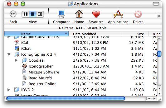
And then, in the middle, there's list view. It sounds pretty straightforward-- a list of files, with all the data for each one listed in columns, sorted by whatever column you click on. It's like the "details" view in Windows. But what makes the Mac's list view fundamentally different from Windows-- and what makes it unique in its operation and keeps it from being just a point along the continuum between placement freedom and navigational speed-- is that it has a unique feature of its own, a feature that Windows still apparently hasn't adopted. That is the ability to expand any folder in the list, inline, by clicking on the triangle next to its name. This gives you a view that's optimized for item data, while de-emphasizing icon placement and (to a lesser extent) navigability.
That's the three views and their conceptual strengths: placement (icon), data (list), and navigation (column). Each view is tuned for its respective goal, with an ideal in sight that serves the feature's design criteria. I can't help but feel that the Windows implementation of its various views had none of these ideals in mind; the designers in that case were evidently more concerned with putting more elements into the "Views" menu than the Mac had, rather than in making each view genuinely and uniquely useful.
In other words, "Views" in Windows is really sort of a slider-- a selector that moves from "big movable icons/no visible data" to "small icons in a list/lots of visible data", with several notches along the way. But if you want a completely different navigational style, you have to go to the "Explorer" view, which you have to enable via the "Explorer bar" menu option, and which gives you a hierarchical tree view. This places navigation outside the standard workflow and divorces it from the listing mechanism itself; you have to know it's there, and you have to contend with the bizarre inverted tree structure which places the Desktop at the top, followed by "My Documents" and the folders on the user's Desktop, among which is "My Computer", followed by the disks. Clicking on folders in the navigation pane opens them in the view pane, but folders are all that's listed in the navigator-- no files, even if they're at the same level as the folders you're looking at. If you're browsing one folder, you can't tell what's in another. It's really easy to get lost in a filesystem that only operates by folder names, rather than by visual feedback that tells you what files and how many of them are in each folder in your navigation path.
This method fits with the now-common Windows method of putting a hierarchical navigator on the left and a view pane on the right, regardless of how inapplicable it might be (IIS, the various Administrative Tools), and regardless of how easy it is to get confused about what you've clicked on, double-clicked on, and collapsed, with the potential for mirroring of hierarchical information from one pane to another. But many of these things let you remove panes, or add new ones, according to taste and need. It's a conceptual model that starts out very small and austere, but forces the user to tack on more and more panels and toolbars to get more functionality-- but which only ends up muddling the workflow.

A filesystem might be hierarchical, but people's brains aren't. When you think about how to move through your disk, you want to pick a single viewing method and be able to do everything in it-- and so your viewing methods are best presented in a flat, equitable manner, with as few choices as possible, with each choice customizable within its own parameters but without forcing the user to hunt down adjuncts in order to make it work properly. Icon, List, Column... pick one depending on what you need. The other two will always be available right there if you change your mind.
And that's the kind of thing Yo-Yo Ma is talking about.
|
|