| Friday, February 1, 2002 |
18:13 - They can dream...
http://www.themexp.org/view_info.php?id=1230
|
(top)  |
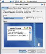
151,037 downloads (and counting) for one of the newest Aqua-esque Windows XP themes that have been posted. And this one is-- well, just look at it.
I don't know where to begin explaining what's wrong. The text is blurry, unregistered, and atrocious. The window control buttons-- there are two of them, red and blue (that right there is as jarring and confusing as seeing a blue traffic light). The title bar is way too big and the edging is sloppy. The sub-window tabs are wrong. The scrollbars are ugly. It's just-- blaugh. This is where you see the difference between a properly designed UI and one done by a hacker. Even with all its bent principles, the Mac OS X UI is the result of some of the best work by some of the best UI designers in the business, and all it takes to appreciate it is to see how bad it looks when imitated poorly.
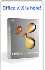
It's very consistent with the Microsoft school of UI, in any case. Whenever they get a set of principles to follow, it's like they read the first two lines of the specification, say "Okay, I get it," and then go to work. That's how we get things like the Office v.X box design and application icons: bulbous, shapeless, syrupy globules. Not symmetrical, candylike diffusions of light-- it's like all they heard was "Make it look 'wet'. You know, 'Aqua'."
In any case, at least four of the top ten XP themes on this site are Aqua themes-- and they keep on trying, making more. It's kinda cute, and kinda sad.
"Duuuude! You're gettin' a Dell! And you can even pretend it's a Mac!"
|
|
