| Monday, October 20, 2003 |
02:27 - Almost doesn't suck
http://www.punningpundit.com/archives/2003_10.html#000985
|
(top)  |
Punning Pundit has posted a followup to his original post on iTunes, in which he had concluded that the app was hobbled by its presumptuous file-organizing behavior and its lack of separate Pause and Stop buttons, among other things. He's had a few days to play with it, and he finds it to be pretty serviceable now-- not the equal of MusicMatch, but not bad.
There are Exactly 2 things MM does better than I-Tunes. Probably neither would be a deal breaker, but together they are important. 1) the aforementioned ID Tag lookup. MM simply does a better job of looking up tags. Yes, there is a bit of manual work involved, but with I-Tunes there is simply a lot more work. 2) AutoDJ. There is a button that let me choose criterion on which to create a playlist. For instance; if I want to listen to 5 hours worth of Upbeat Slow music, and have more than 5 hrs of that kind of music, MM will create a playlist for me. I can choose up to 3 criterion (Album, Artist, Genre, Tempo, Mood, Situation, Preference) If have less than that, MM will simply put what I have in random order. Keeping track of this sort of information is exactly the point of ID tags. Frankly I am surprised that Apple doesn't have this feature. If anyone wants to tell me where it is, I�ll look at I-tunes again. But I did look for it and didn�t find it...
I-Tunes is a wonderfully simple piece of software. If I MusicMatch didn't exist, I�d be using it. Frankly I am surprised more people don�t use MusicMatch, but it is clear which is the superior software...
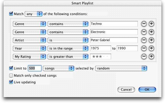
I think he'll find that what he's looking for, in his second concern, is Smart Playlists. These are effectively database queries, which you can specify with an arbitrary number of clauses, either in an "and" or "or" context. Each clause can be an exact match, a beginning/end/partial match, or a negative match-- or a range, or a numerical comparison if applicable. There are also a few additional criteria you can specify-- matching only checked songs, a limit/order clause, and whether or not for the query to be re-executed every time your Library changes. Pretty much everything you can do in SQL, with the exception of logical groupings (i.e. paranthetical clauses).
Of course it's a bit less yucky than that in execution:
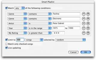
Hold down Option (or Shift on Windows) and click the New Playlist button to create one.
Anyway, perhaps he's right, about MusicMatch being everything iTunes is and more-- never having used it, I can't say with any authority. I'm only going by what friends have told me, and my own perfunctory experience gained through P2P-app testing, in which I gain more familiarity with how each program looks at the TCP/IP level than at the UI level. It does sound like MusicMatch has a few features that iTunes lacks, and the fill-in-all-ID3-tags-based-on-what-you've-already-specified sounds pretty useful. For a program designed for one-off MP3 collectors rather than legitimate music owners, it's a feature that definitely has utility.
From a glance, though, it looks to me as though MusicMatch's interface lists songs in the usual Windows hierarchical scheme, with those little [+] boxes in a long vertical column of inscrutable category entries. Probably it's configurable; I don't know. Maybe there's a more straightforward way to display your songs than distinguishing between "Favorites" and "My Matches" and so on. Perhaps users of MusicMatch don't need a more straightforward view. After all:
Anyone who is new to digital music would do well to start with I-tunes... Indeed, that seems to be the assumption Apple is making; users are beginners.
I'd tend to disagree, and counter that what Apple is catering to is not beginners, but simply people who don't want to put up with unnecessary crap. I like to think of myself as not being a "beginner", though I'm sure that's open to debate. Most Mac users I know, though, are about as far from being "beginners" as they can get, and they appreciate apps like iTunes specifically because of the forthrightness of the interface. There's no needless complexity. There are no multiple levels of hierarchical organization. Everything works the same, no matter which screen you're in-- and I, personally, find that to be precisely what makes iTunes so fulfilling to use. It isn't something I have to cope with or figure out. It's something that does what I want, seeming to anticipate my needs, and then gets out of the way.
I could be mistaken, but it's my understanding that MusicMatch was written in direct response to iTunes, which was released in January 2000 (on OS 9-- boy, that takes you back, don't it?). The goal was to do iTunes one better-- take the iTunes interface and add some extra low-hanging features. That appears to be where we are today-- the two apps have rough feature parity, and the layout is even fairly similar. But you can tell at a glance the two traditions that they came from; and while I know MusicMatch's appearance has changed over the years (it used to be dark blue/purple/black, with lots of car-stereo chrome), iTunes' hasn't. It's those two different schools of thought-- striving for the edge and always going for the new hot angle, or offering subtle consistency year after year. And for what it's worth, one doesn't have to be a "beginner' to gravitate toward the latter.
Me, I love iTunes' automatic organizing of my music files. It means that no matter how I edit the track names, albums, artists-- no matter whether I enter Japanese track names in Unicode, or whether I spell the name "Bjork" or "Bj�rk" (iTunes sorts both of those into the same artist entry, coalescing all vowel variants), or whether I want to leave my soundtrack CDs as being by "Various Artists" or whether I want to give each track its proper artist credits and just call the disc a "Compilation", iTunes will guarantee that it'll take me just a few well-placed firing-range clicks in Column View to drill down to the track I want. Or I can just search for the track in iTunes and then drag the song in question right out of the display window into whatever other app window I want to copy it to. Either way-- it's all good.
Apple doesn't design "computers for dummies". Sure, they design computers that novices can immediately use, and comfortably. But the goals of novices and the goals of seasoned computer users are not necessarily incompatible.
I made my peace, about three years ago, with the idea that the key to making friends with Apple software-- with which I wasn't on especially good terms at the time-- was to understand the design concept behind it, and just work with it as designed. Once I learned to stop fighting and love the iBomb, it was like the sun abruptly coming out; all it took was letting go of my control over my MP3s' filenames, my custom visualizer settings, my disk and RAM usage, and so on-- and everything just started to make so much sense. And what's more, once I accepted those default behaviors, I was able to find customizable settings for all of those: I could turn off automatic MP3 organization, and have iTunes play files from wherever in the system they were; I could track down plugins for alternate visualizers (like G-Force) or even new codecs (like Ogg Vorbis); I could tweak things to minimize resource impact. But oddly enough, I didn't want to.
Apple doesn't choose its default settings lightly. When it first came out that Mac OS X was going to "solve" the problem of filename extensions vs. Type and Creator codes by making it so that files were type-associated by extension, but the extension could be hidden on a per-file basis-- and what's more, the default setting for "always show filename extensions" was going to be off-- I threw a titanic hissy fit. But then I started thinking about it. And I started using it. And I realized what it was that Apple was doing: They were designing the file-typing system so that file types would be identified by a piece of required meta-data that's built into the filename and useful on multiple platforms, rather than depending on a piece of external meta-data that gets lost if you send a file to a Windows machine, making the file unassociated with any application. And Mac users could hide the extension-- by "deleting" it in the Finder-- so that as far as he or any Mac application is concerned, the extension isn't there at all. So "My 2000 Taxes.pdf" can appear as "My 2000 Taxes"... but if you were to mail that file to a Windows user, it would still work as a perfectly normal PDF file. And on the Mac side, the hiding would be on a per-file basis, not a global basis like the analogous switch in Windows that causes so many problems ("What, you mean I shouldn't have double-clicked on virus.gif.vbs?"). And finally, on the Mac, with the Type code deprecated, the Creator code was also replaced with the much more flexible Opener attribute-- which let you set global associations per-type as well as individual ones per-file. It was less pleasingly symmetrical than the old Type and Creator codes, but.... frankly, a lot more useful, and a lot more cross-platform friendly. And it barely impacted Mac users at all. Whoever came up with the idea, I'm now convinced, deserves a sharp, shiny piece of engraved Lucite to put on his desk and use to impale presumptuous morons like me who come into his office and try to tell him how to do UI design.
All it took was for me to drink the Kool-Aid, as it were. Or less glibly, I just had to recognize their design reasoning-- and once I did, everything just started making sense.
So it is with iTunes. It appears simplistic, to anyone familiar with Windows apps. But just because it's more spare doesn't mean it's designed for beginners. It's not. It's designed for no-nonsense usefulness. And it doesn't take a beginner to appreciate that.
Maybe MusicMatch is everything that iTunes is, plus benefits. But a whole lotta people are apparently finding that iTunes offers something that has never really been seen before on Windows: an app that puts the fun back into functionality.
All it takes to appreciate it is to give oneself over to the new, possibly alien ideas that iTunes brings. They're really not so bad. They may even be just what you're looking for.
Don't fight it. Go to sleep. Sleeeeeeep. Close your eyes. It'll be aaaall right. <wiggles fingers>
|
|
 Brian Tiemann