| Tuesday, November 9, 2004 |
16:33 - Popular vs. Electoral
|
(top)  |
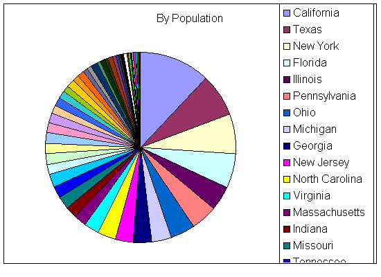
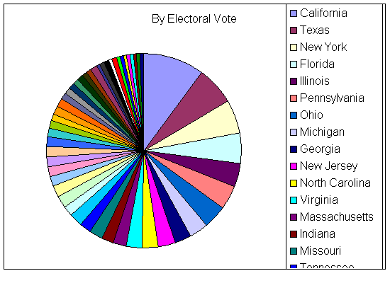
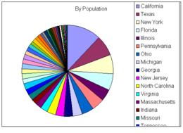
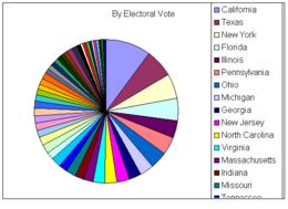
This is kinda interesting. I stuck the electoral vote figures for the fifty states into Excel and did two pie charts: one showing how the relative influences of the states break down if judged purely by population, and another showing what happens (particularly to the smallest slices) once the ratios are adjusted by adding the two Senate seats to each of the states' House seats to come up with the electoral total.
It's like a golfer's handicap: raising the floor a little so everyone is just a little closer to even. Not much. But probably as much as it should be.
|
|
 Brian Tiemann